
Best Resume Fonts for 2025 — Proven Picks for Job Seekers
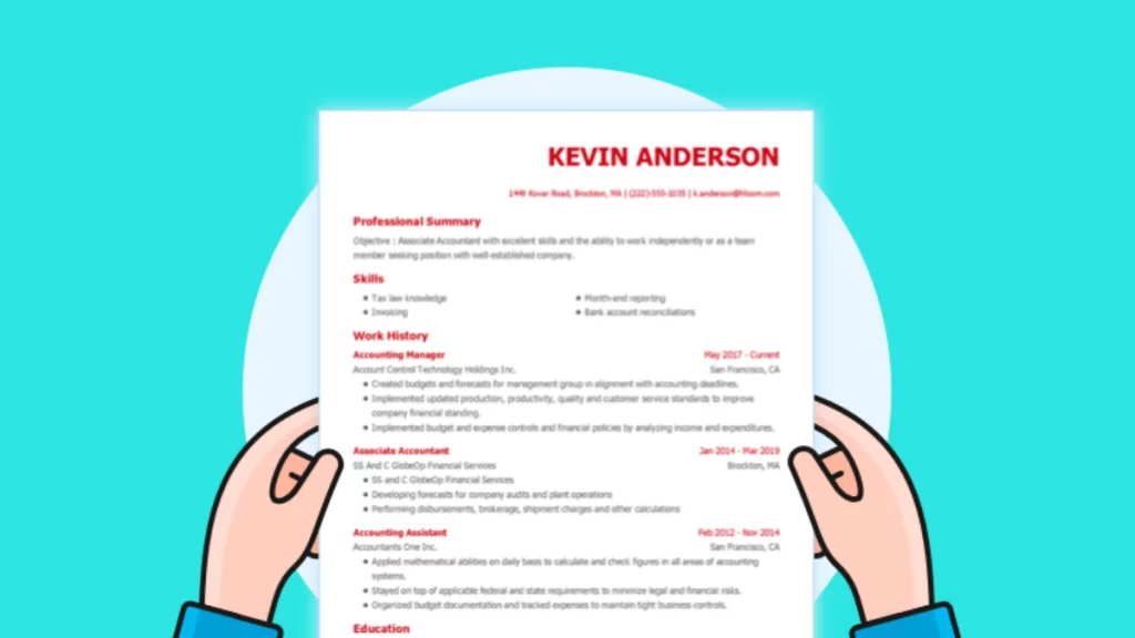
Picking the best Resume font is not about style alone. Hiring teams in Australia decide within seconds whether to keep reading, and clear text is one of the first signals they notice.
A font such as Calibri or Arial lets them focus on your achievements instead of squinting at ornate letters.
Font choice also affects how an Applicant Tracking System reads your file. Most ATS programs parse mainstream typefaces with ease, so a professional Resume font improves your odds of passing the first screen.
Use a size between 10 pt and 12 pt; stay consistent in headings and body text; and avoid fonts on the common “Resume fonts to avoid” list so your document stays searchable.

The Top Resume Fonts in Detail
Page Contents
Calibri – The Safe Pick
The default Microsoft font is clean and compact. Calibri stays formal without looking stiff, so it suits most roles. If you want the best font for a Resume Australia hiring managers expect, start here.
Arial – Familiar and Wide
Arial reads well on-screen and in print. It is slightly larger than Calibri, so watch your page length. When someone asks “what font should a Resume be?” Arial remains a common answer.
Arial Narrow – Space Saver
Need to trim a line or two? Arial Narrow keeps the Arial look while reducing width. Use it sparingly—tight spacing can feel crowded if the size drops below 10 pt.
Verdana – Modern and Open
Verdana blends Arial’s width with softer curves, giving a friendly tone for customer-facing roles. Its generous spacing adds white space, so balances with concise bullet points.
Book Antiqua – Creative Edge
Book Antiqua pairs classic serifs with a warmer feel than Times New Roman. Designers and artists often pick it. If you work in the arts, this can be the best font for Resume originality without going too far.
Cambria – Formal but Fresh
Cambria offers a traditional serif look with improved screen legibility. It helps you stand out in law, consulting, and research roles where a hint of tradition still matters.
Best Font for Cover Letters
Use the same family across documents for consistency. The best font for cover letters is usually the one on your Resume—Calibri, Arial, or Cambria. Matching fonts support ATS parsing and create a unified set.
Fonts Australian Recruiters Love
Local hiring teams report that good Resume fonts are those they see daily in Office 365 files:
(table below)
| Font | Why it works in AU hiring |
| Calibri | Default in Word; matches common standards |
| Arial | Reads well on cloud ATS portals |
| Cambria | Formal yet easy to scan on mobile |
Resume Fonts to Avoid
Skip any font that looks playful, ornate, or dated:
- Comic Sans
- Times New Roman (too dense for modern screens)
- Poor Richard
- Bookman Old Style
- Onyx
- Harrington
These styles slow reading and feel unprofessional.

Resume Font Checklist
- Stay consistent. Use one professional Resume font across your Resume and cover letter to keep your personal brand clear.
- Size it right. Body text should sit between 10 pt and 12 pt; bump headings up by 2 pt for easy scanning.
- Start with the safe pair. Calibri or Arial is the best first choice; switch only if space is tight or the role calls for a serif.
- Match font to field. Sans-serif fonts (Calibri, Arial, Verdana) fit business and tech; serif fonts (Cambria, Book Antiqua) suit law, academia, and the arts.
- Mind the spacing. Set line spacing to 1.0–1.15 and add a 6 pt gap after paragraphs so text doesn’t look cramped.
- Do a phone test. Export to PDF and read it on your phone—every word should stay sharp, with no awkward line breaks.
Need help polishing the rest of your application? Download our modern CV template (Word, free) or contact the Careers Team for one-on-one advice.
Good luck with your job search!
Careers Team, Career Success Australia


Hi Naren,
Great post! Font choice is often overlooked, but as you pointed out, it plays a big role in readability and first impressions. I still see many job seekers default to Times New Roman—do you think that’s due to outdated advice, or do some industries in Australia still prefer it?
Thanks for sharing these insights! Looking forward to your thoughts.
Great insights on resume fonts! I never realized how much typography could impact an employer’s perception. I’ll definitely be trying out some of the recommended fonts for my next application. Thanks!